
Multi Select Combobox
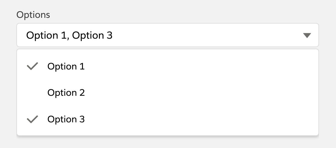
Combobox with different configuration options that also supports multi select.
Available in: Not exposed in the Lightning App Builder - intended to be embedded in other components.
Read on Medium
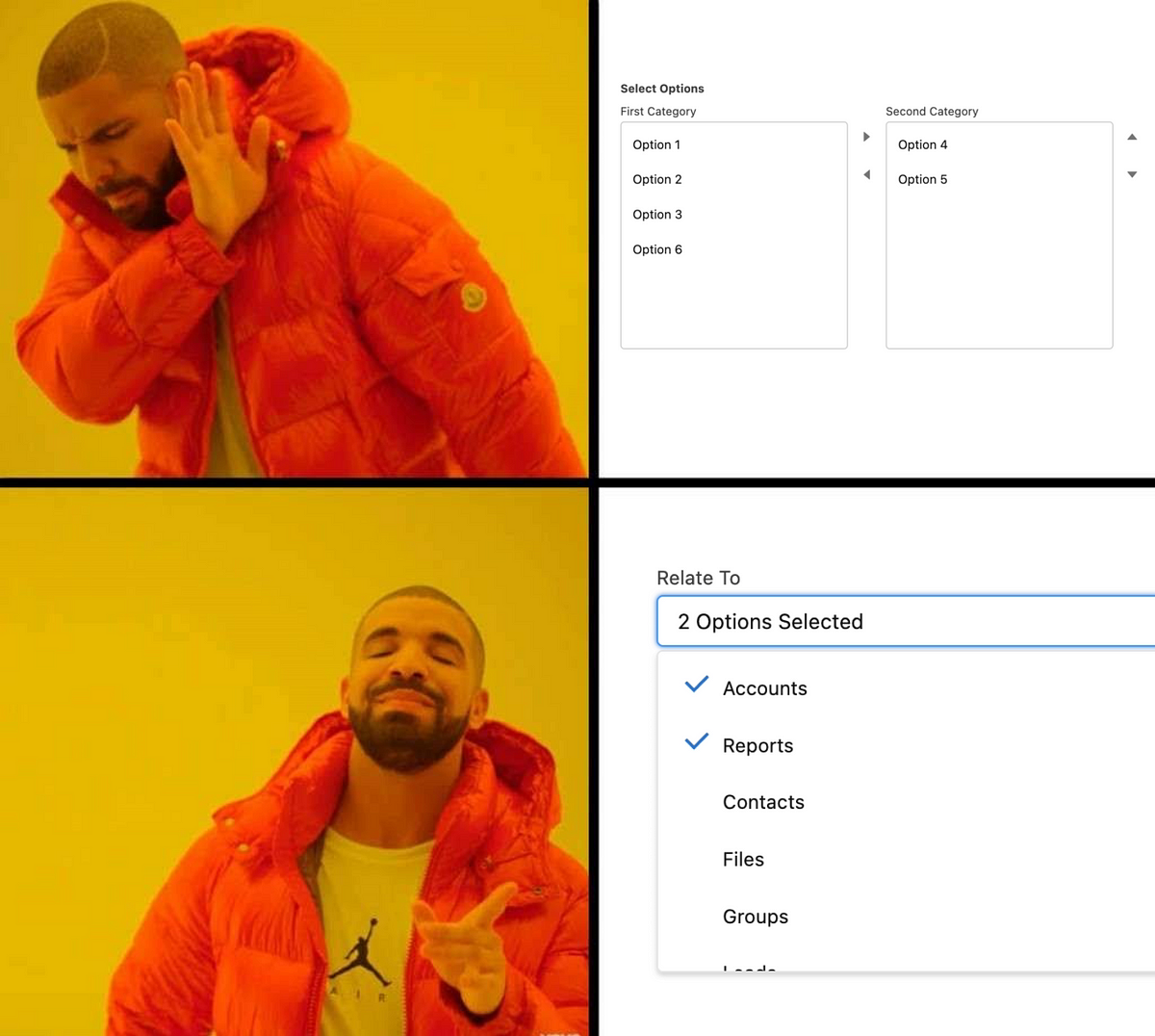
How to Create the LWC Multi-Select Combobox that Salesforce is Still Missing
Attributes
| Name | Type | Default | Description |
|---|---|---|---|
| disabled | boolean | false | If present, the combobox is disabled and users cannot interact with it. |
| enable-search | boolean | false | If present, a search input is shown inside the dropdown to filter options by label. |
| label | string | '' | Text label for the combobox. |
| name | string | Specifies the name of the combobox. | |
| options | Array | [] | A list of options that are available for selection. Each option has the following attributes: label and value. |
| placeholder | string | 'Select an Option' | Text that is displayed before an option is selected, to prompt the user to select an option. |
| read-only | boolean | false | If present, the combobox is read-only. A read-only combobox is also disabled. |
| required | boolean | false | If present, a value must be selected before a form can be submitted. |
| single-select | boolean | false | If present, the combobox only allows the selection of a single value. |
| show-pills | boolean | false | If present, the combobox will show a pill container with the currently selected options. |
Usage
html
<c-multi-select-combobox
  label="Products"
  name="products"
  options={options}
  onchange={handleChange}
  show-pills
  enable-search
></c-multi-select-combobox>
Each option requires a label and a value.
Events
| Name | Detail | Description |
|---|---|---|
| change | The selected options as an array, or a single option object if single-select is set. | Fired when the selection changes. |
| close | - | Fired when the dropdown is closed. |
Component Dependencies
| Name | Type | Description |
|---|---|---|
| multiSelectComboboxItem | LWC | Child component that represents an item within the multiSelectCombobox parent component. |