
Custom Carousel
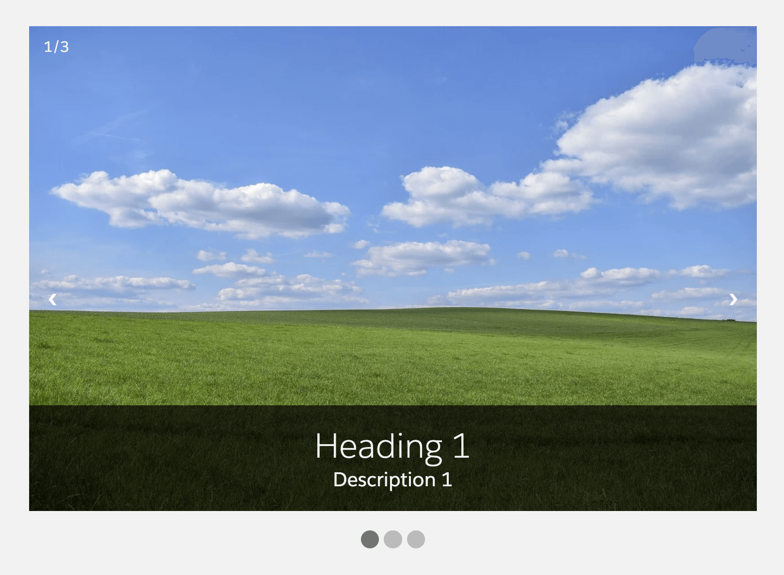
A simple custom carousel with different configuration options.
Available in: App Page · Home Page · Record Page
Attributes
| Name | Type | Default | Description |
|---|---|---|---|
| auto-scroll | boolean | false | If present, automatic slide scrolling will be enabled. |
| custom-height | string | '' | Set maximum height of the carousel in percent or pixels. |
| custom-width | string | '600px' | Set maximum width of the carousel in percent or pixels. |
| hide-navigation-buttons | boolean | false | If present, the "next" and "prev" navigation buttons will be hidden. |
| hide-navigation-dots | boolean | false | If present, the navigation dots below the carousel will be hidden. |
| hide-slide-number | boolean | false | If present, the current slide number will be hidden. |
| hide-slide-text | boolean | false | If present, the text overlay with heading and description will be hidden. |
| scroll-duration | number | 5000 | Set the duration in milliseconds after which the next slide should be displayed. |
| slides-data | Array | JSON array of slides that are displayed in the custom carousel. Each slide has the following attributes: image, heading and description. |
Example slides-data JSON array;
[
  {
    "image": "https://example.com/image1.jpg",
    "heading": "Slide 1",
    "description": "Description for slide 1"
  },
  {
    "image": "https://example.com/image2.jpg",
    "heading": "Slide 2",
    "description": "Description for slide 2"
  },
  {
    "image": "https://example.com/image3.jpg",
    "heading": "Slide 3",
    "description": "Description for slide 3"
  }
]
Usage
html
<c-custom-carousel slides-data={slides} custom-width="800px" auto-scroll scroll-duration="7000"></c-custom-carousel>When adding the component to a page in the Lightning App Builder, paste a slides JSON array like the example above into the slides-data property.