
Custom Datatable
A basic custom datatable with different configuration options.
Available in: App Page · Home Page · Record Page · Flow Screen
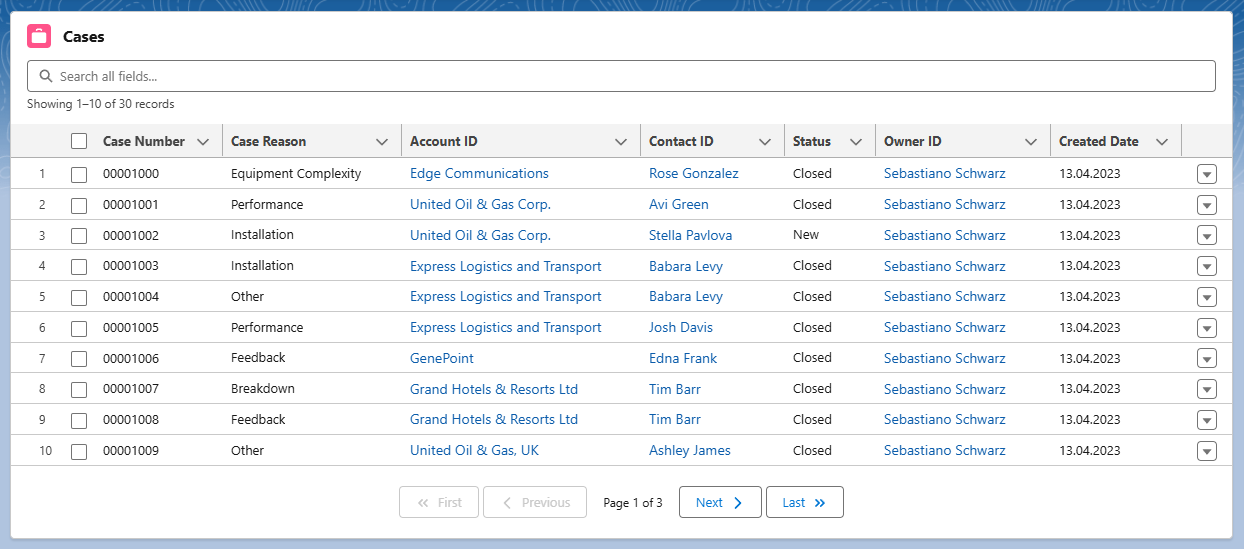
Attributes
| Name | Type | Default | Description |
|---|---|---|---|
| card-icon | string | '' | If show card option is active, the card icon is displayed in the header before the card title. It should contain the SLDS name of the icon. Specify the name in the format 'utility:down' where 'utility' is the category and 'down' the icon to be displayed. |
| card-title | string | '' | If show card option is active, the card title can include text and is displayed in the header above the table. |
| column-widths-mode | string | 'fixed' | Specifies how column widths are calculated. Set to 'fixed' for columns with equal widths. Set to 'auto' for column widths that are based on the width of the column content and the table width. |
| default-sort-direction | string | 'asc' | Specifies the default sorting direction on an unsorted column. Valid options include 'asc' and 'desc'. |
| enable-pagination | boolean | false | If present, server-side pagination is enabled with page controls to navigate through records. |
| enable-search | boolean | false | If present, a server-side fuzzy search input is displayed to filter records across all text fields. |
| enable-sorting | boolean | false | If present, column headers become clickable to sort records server-side via an Apex ORDER BY clause. Lookup columns are excluded from sorting. |
| field-set-api-name | string | '' | API name of the field set that specifies which fields are displayed in the table. |
| hide-checkbox-column | boolean | false | If present, the checkbox column for row selection is hidden. |
| hide-table-header | boolean | false | If present, the table header is hidden. |
| is-used-as-related-list | boolean | false | If present, the table is wrapped with the correct page header to fit better into the related list layout. |
| key-field | string | 'Id' | Required field for better table performance. Associates each row with a unique Id. |
| max-column-width | number | 1000 | The maximum width for all columns. The default is 1000px. |
| max-row-selection | number | 50 | The maximum number of rows that can be selected. Checkboxes are used for selection by default, and radio buttons are used when maxRowSelection is 1. |
| min-column-width | number | 50 | The minimum width for all columns. The default is 50px. |
| object-api-name | string | '' | API name of the object that will be displayed in the table. |
| page-size | number | 10 | The number of records displayed per page when pagination is enabled. The default is 10. |
| read-only | boolean | false | If present, then all datatable fields are not editable. |
| resize-column-disabled | boolean | false | If present, column resizing is disabled. |
| row-number-offset | number | 0 | Determines where to start counting the row number. |
| show-card | boolean | false | If present, the table is wrapped in a lightning card to fit better into the overall page layout. |
| show-delete-row-action | boolean | false | If present, the last column contains a delete record action. |
| show-edit-row-action | boolean | false | If present, the last column contains a edit record action. |
| show-multiple-row-delete-action | boolean | false | If present, a delete action button is available when multiple records are selected. This is only available if the checkbox column is visible and the table is either displayed with a Lightning Card or as a Related List. |
| show-row-number-column | boolean | false | If present, the row numbers are shown in the first column. |
| show-view-row-action | boolean | false | If present, the last column contains a view record action. |
| suppress-bottom-bar | boolean | false | If present, the footer that displays the Save and Cancel buttons is hidden during inline editing. |
| where-conditions | string | '' | Optional where clause conditions for loaded data records. Example: Status = 'New' |
Usage
html
<c-custom-datatable
  object-api-name="Case"
  field-set-api-name="CaseFieldSet"
  where-conditions="Status = 'New'"
  show-card
  card-title="Open Cases"
  enable-search
  enable-sorting
  enable-pagination
></c-custom-datatable>
The displayed columns are driven by a field set on the object, so the table can be reconfigured without code changes. All attributes are also configurable in the Lightning App Builder, so no code is required to use the component.
Component Dependencies
| Name | Type | Description |
|---|---|---|
| datatableExtension | LWC | Custom extension of the standard LWC datatable to support individual table cell types. |
| datatableLookup | LWC | Custom datatable cell type to display lookup fields that are not supported by default. |
| datatablePagination | LWC | Reusable pagination navigation bar with First, Previous, Next, and Last buttons. |
| datatableUtils | LWC | Shared utility functions for row actions, CRUD operations, and datatable properties. |
| CustomDatatableUtil | Apex | Controller class for handling the columns configuration and data provisioning. |
| CustomDatatableUtilTest | Apex | Test class for CustomDatatableUtil. |