---
url: /awesome-lwc-collection/components/customDatatable.md
description: A basic custom datatable with different configuration options.
---
# Custom Datatable
A basic custom datatable with different configuration options.
**Type:** Component
**Available in:** App Page · Home Page · Record Page · Flow Screen
## Attributes
| Name | Type | Default | Description |
| ------------------------------- | ------- | ------- | -------------------------------------------------------------------------------------------------------------------------------------------------------------------------------------------------------------------------------------------------------------- |
| card-icon | string | '' | If show card option is active, the card icon is displayed in the header before the card title. It should contain the SLDS name of the icon. Specify the name in the format 'utility:down' where 'utility' is the category and 'down' the icon to be displayed. |
| card-title | string | '' | If show card option is active, the card title can include text and is displayed in the header above the table. |
| column-widths-mode | string | 'fixed' | Specifies how column widths are calculated. Set to 'fixed' for columns with equal widths. Set to 'auto' for column widths that are based on the width of the column content and the table width. |
| default-sort-direction | string | 'asc' | Specifies the default sorting direction on an unsorted column. Valid options include 'asc' and 'desc'. |
| enable-pagination | boolean | false | If present, server-side pagination is enabled with page controls to navigate through records. |
| enable-search | boolean | false | If present, a server-side fuzzy search input is displayed to filter records across all text fields. |
| enable-sorting | boolean | false | If present, column headers become clickable to sort records server-side via an Apex `ORDER BY` clause. Lookup columns are excluded from sorting. |
| field-set-api-name | string | '' | API name of the field set that specifies which fields are displayed in the table. |
| hide-checkbox-column | boolean | false | If present, the checkbox column for row selection is hidden. |
| hide-table-header | boolean | false | If present, the table header is hidden. |
| is-used-as-related-list | boolean | false | If present, the table is wrapped in a card styled like a native related list, so it fits in with the related lists around it. |
| key-field | string | 'Id' | Required field for better table performance. Associates each row with a unique Id. |
| max-column-width | number | 1000 | The maximum width for all columns. The default is 1000px. |
| max-row-selection | number | 50 | The maximum number of rows that can be selected. Checkboxes are used for selection by default, and radio buttons are used when maxRowSelection is 1. |
| min-column-width | number | 50 | The minimum width for all columns. The default is 50px. |
| table-object-api-name | string | '' | API name of the object that will be displayed in the table. |
| page-size | number | 10 | The number of records displayed per page when pagination is enabled. The default is 10. |
| read-only | boolean | false | If present, then all datatable fields are not editable. |
| resize-column-disabled | boolean | false | If present, column resizing is disabled. |
| row-number-offset | number | 0 | Determines where to start counting the row number. |
| show-card | boolean | false | If present, the table is wrapped in a lightning card to fit better into the overall page layout. |
| show-delete-row-action | boolean | false | If present, the last column contains a delete record action. |
| show-edit-row-action | boolean | false | If present, the last column contains a edit record action. |
| show-multiple-row-delete-action | boolean | false | If present, a delete action button is available when multiple records are selected. This is only available if the checkbox column is visible and the table is either displayed with a Lightning Card or as a Related List. |
| show-row-number-column | boolean | false | If present, the row numbers are shown in the first column. |
| show-view-row-action | boolean | false | If present, the last column contains a view record action. |
| suppress-bottom-bar | boolean | false | If present, the footer that displays the Save and Cancel buttons is hidden during inline editing. |
| where-conditions | string | '' | Optional where clause conditions for loaded data records. Example: `Status = 'New'` |
## Usage
```html
```
The displayed columns are driven by a field set on the object, so the table can be reconfigured without code changes. All attributes are also configurable in the Lightning App Builder, so no code is required to use the component.
## Custom Labels
The texts users see are Custom Labels, so they can be translated in Setup with the Translation Workbench. Copy them together with the component.
| Name | Value |
| ------------------------------------ | ------------------------------ |
| CustomDatatable_Delete | Delete |
| CustomDatatable_ErrorDeletingRecord | Error deleting record |
| CustomDatatable_ErrorDeletingRecords | Error deleting records |
| CustomDatatable_ErrorLoadingRecords | Error loading records |
| CustomDatatable_ErrorUpdatingRecords | Error updating records |
| CustomDatatable_Loading | Loading |
| CustomDatatable_Page | Page {0} of {1} |
| CustomDatatable_RecordCount | Showing {0}–{1} of {2} records |
| CustomDatatable_RecordDeleted | Record deleted |
| CustomDatatable_RecordsDeleted | Records deleted |
| CustomDatatable_RecordsUpdated | Records updated |
| CustomDatatable_Search | Search |
| CustomDatatable_SearchPlaceholder | Search all fields... |
| CustomDatatable_Success | Success |
| DatatablePagination_First | First |
| DatatablePagination_Last | Last |
| DatatablePagination_Next | Next |
| DatatablePagination_Previous | Previous |
| DatatableUtils_Delete | Delete |
| DatatableUtils_Edit | Edit |
| DatatableUtils_View | View |
| ErrorUtils_UnknownError | Unknown error |
## Component Dependencies
| Name | Type | Description |
| ----------------------- | ---- | -------------------------------------------------------------------------------------- |
| datatableExtension | LWC | Custom extension of the standard LWC datatable to support individual table cell types. |
| datatableLookup | LWC | Custom datatable cell type to display lookup fields that are not supported by default. |
| datatablePagination | LWC | Reusable pagination navigation bar with First, Previous, Next, and Last buttons. |
| datatableUtils | LWC | Shared utility functions for row actions, CRUD operations, and datatable properties. |
| CustomDatatableUtil | Apex | Controller class for handling the columns configuration and data provisioning. |
| CustomDatatableUtilTest | Apex | Test class for CustomDatatableUtil. |
| errorUtils | LWC | Shared functions to read error messages and show error toasts. |
| labelUtils | LWC | Shared function to fill the placeholders of Custom Labels. |
---
---
url: /awesome-lwc-collection/components/graphqlDatatable.md
description: >-
A custom datatable powered by the GraphQL wire adapter (lightning/graphql)
instead of Apex.
---
# GraphQL Datatable
A custom datatable powered by the GraphQL wire adapter (`lightning/graphql`) instead of Apex.
**Type:** Component
**Available in:** App Page · Home Page · Record Page · Flow Screen
## Read on Medium
**[Replace Apex with GraphQL in Your Salesforce UI Architecture](https://medium.com/capgemini-salesforce-architects/replace-apex-with-graphql-in-your-salesforce-ui-architecture-62693ff40f5b)**
## Attributes
| Name | Type | Default | Description |
| ------------------------------- | ------- | ------- | -------------------------------------------------------------------------------------------------------------------------------------------------------------------------------------------------------------------------------------------------------------- |
| card-icon | string | '' | If show card option is active, the card icon is displayed in the header before the card title. It should contain the SLDS name of the icon. Specify the name in the format 'utility:down' where 'utility' is the category and 'down' the icon to be displayed. |
| card-title | string | '' | If show card option is active, the card title can include text and is displayed in the header above the table. |
| column-widths-mode | string | 'fixed' | Specifies how column widths are calculated. Set to 'fixed' for columns with equal widths. Set to 'auto' for column widths that are based on the width of the column content and the table width. |
| default-sort-direction | string | 'asc' | Specifies the default sorting direction on an unsorted column. Valid options include 'asc' and 'desc'. |
| enable-pagination | boolean | false | If present, cursor-based pagination is enabled with page controls to navigate through records. |
| enable-search | boolean | false | If present, a GraphQL-based search input is displayed to filter records across all text fields using the `like` operator. |
| enable-sorting | boolean | false | If present, column headers become clickable to sort records via a GraphQL `orderBy` clause. Lookup and unknown field columns are excluded from sorting. |
| fields | string | '' | Comma-separated list of field API names to display in the table. Example: `Name,Email,Phone`. |
| hide-checkbox-column | boolean | false | If present, the checkbox column for row selection is hidden. |
| hide-table-header | boolean | false | If present, the table header is hidden. |
| is-used-as-related-list | boolean | false | If present, the table is wrapped in a card styled like a native related list, so it fits in with the related lists around it. |
| key-field | string | 'Id' | Required field for better table performance. Associates each row with a unique Id. |
| max-column-width | number | 1000 | The maximum width for all columns. The default is 1000px. |
| max-row-selection | number | 50 | The maximum number of rows that can be selected. Checkboxes are used for selection by default, and radio buttons are used when maxRowSelection is 1. |
| min-column-width | number | 50 | The minimum width for all columns. The default is 50px. |
| table-object-api-name | string | '' | API name of the object that will be displayed in the table. |
| page-size | number | 10 | The number of records displayed per page when pagination is enabled. The default is 10. |
| read-only | boolean | false | If present, then all datatable fields are not editable. |
| resize-column-disabled | boolean | false | If present, column resizing is disabled. |
| row-number-offset | number | 0 | Determines where to start counting the row number. |
| show-card | boolean | false | If present, the table is wrapped in a lightning card to fit better into the overall page layout. |
| show-delete-row-action | boolean | false | If present, the last column contains a delete record action. |
| show-edit-row-action | boolean | false | If present, the last column contains a edit record action. |
| show-multiple-row-delete-action | boolean | false | If present, a delete action button is available when multiple records are selected. This is only available if the checkbox column is visible and the table is either displayed with a Lightning Card or as a Related List. |
| show-row-number-column | boolean | false | If present, the row numbers are shown in the first column. |
| show-view-row-action | boolean | false | If present, the last column contains a view record action. |
| suppress-bottom-bar | boolean | false | If present, the footer that displays the Save and Cancel buttons is hidden during inline editing. |
| where-conditions | string | '' | Optional GraphQL where clause conditions for loaded data records. Example: `{ Status: { eq: "New" } }`. |
## Usage
```html
```
All attributes are also configurable in the Lightning App Builder, so no code is required to use the component.
## Custom Labels
The texts users see are Custom Labels, so they can be translated in Setup with the Translation Workbench. Copy them together with the component.
| Name | Value |
| ------------------------------------- | ------------------------------ |
| DatatablePagination_First | First |
| DatatablePagination_Last | Last |
| DatatablePagination_Next | Next |
| DatatablePagination_Previous | Previous |
| DatatableUtils_Delete | Delete |
| DatatableUtils_Edit | Edit |
| DatatableUtils_View | View |
| ErrorUtils_UnknownError | Unknown error |
| GraphqlDatatable_Delete | Delete |
| GraphqlDatatable_ErrorDeletingRecord | Error deleting record |
| GraphqlDatatable_ErrorDeletingRecords | Error deleting records |
| GraphqlDatatable_ErrorLoadingRecords | Error loading records |
| GraphqlDatatable_ErrorUpdatingRecords | Error updating records |
| GraphqlDatatable_Loading | Loading |
| GraphqlDatatable_Page | Page {0} of {1} |
| GraphqlDatatable_RecordCount | Showing {0}–{1} of {2} records |
| GraphqlDatatable_RecordDeleted | Record deleted |
| GraphqlDatatable_RecordsDeleted | Records deleted |
| GraphqlDatatable_RecordsUpdated | Records updated |
| GraphqlDatatable_Search | Search |
| GraphqlDatatable_SearchPlaceholder | Search all fields... |
| GraphqlDatatable_Success | Success |
## Component Dependencies
| Name | Type | Description |
| ------------------- | ---- | -------------------------------------------------------------------------------------- |
| datatableExtension | LWC | Custom extension of the standard LWC datatable to support individual table cell types. |
| datatableLookup | LWC | Custom datatable cell type to display lookup fields that are not supported by default. |
| datatablePagination | LWC | Reusable pagination navigation bar with First, Previous, Next, and Last buttons. |
| datatableUtils | LWC | Shared utility functions for row actions, CRUD operations, and datatable properties. |
| errorUtils | LWC | Shared functions to read error messages and show error toasts. |
| labelUtils | LWC | Shared function to fill the placeholders of Custom Labels. |
---
---
url: /awesome-lwc-collection/components/csvImporter.md
description: >-
Imports CSV files into Salesforce in steps: the file is read and previewed,
its columns are mapped to the fields of an object, the rows are checked
against these fields, and then inserted or upserted.
---
# CSV Importer
Imports CSV files into Salesforce in steps: the file is read and previewed, its columns are mapped to the fields of an object, the rows are checked against these fields, and then inserted or upserted.
**Type:** Component
**Available in:** App Page · Home Page · Record Page · Flow Screen
## Read on Medium
**[How to Build a Simple CSV Parser with Lightning Web Components](https://javascript.plainenglish.io/how-to-build-a-simple-csv-parser-with-lightning-web-components-464a110a1cd2)**
## Attributes
| Name | Type | Default | Description |
| -------------------------- | -------- | ------- | ---------------------------------------------------------------------------------------------------------------------------------------------------------------------------------------------------- |
| external-id-field-api-name | string | '' | The field the rows are upserted by, e.g. an external ID field or Id: rows with the value of an existing record update it, the others create new records. Without it, every row creates a new record. |
| import-object-api-name | string | '' | The object the rows are imported into, e.g. 'Contact'. Without it, users enter the object in the wizard. |
| max-file-size-mb | number | 5 | The largest file in megabytes that can be read. |
| max-rows | number | 10000 | The most rows a file may have, not counting the header. |
| success-count | number | 0 | Read-only. The number of rows that created or updated a record in the last import. Also available as a Flow output. |
| failed-count | number | 0 | Read-only. The number of rows that failed in the last import. Also available as a Flow output. |
| created-record-ids | string\[] | \[] | Read-only. The ids of the records the last import created. Also available as a Flow output. |
## Events
| Name | Detail | Description |
| -------- | ----------------------------------------------------------------------------------------------------------------------------------------------------------------- | ----------------------------------------------------------------------------------- |
| imported | `objectApiName`; `created`, `updated` and `failed`: the number of rows; `recordIds`: the ids of the saved records; `createdRecordIds`: the ids of the new records | Fired when the import is done. |
| parsed | A copy of the result: `fileName`, `headers`, `keyField`, `rows` and `delimiter` | Fired when a file was parsed. `keyField` names the property holding each row's key. |
## Usage
```html
```
### Upload
Drop a `.csv` file on the upload area or select it. The importer shows the first 20 rows and how many rows the file has.
* The delimiter is detected from the first line: comma, semicolon or tab, whichever occurs most often outside quoted fields. It can also be chosen by hand.
* The encoding is UTF-8 by default; choose Windows-1252 for files exported by older versions of Excel. Changing the delimiter or the encoding reads the file again.
* Files larger than max-file-size-mb or with more rows than max-rows are rejected with a message.
Files are parsed according to [RFC 4180](https://www.rfc-editor.org/rfc/rfc4180) by the shared `c/csvParser` module:
* Quoted fields may contain delimiters, line breaks and doubled quotes (`""`).
* Empty lines are ignored, including a trailing one.
* Rows with fewer columns than the header are filled with empty values, and values beyond the last header column are dropped.
* Empty and duplicate column names get a unique name, such as `Column 2` or `Name (2)`.
If a file cannot be read or is not valid CSV, for example because a quote is never closed, the importer clears the preview and shows an error message.
### Map fields
The next step maps every column to a field of the object set in import-object-api-name, or of the object users enter by its API name. It isn't called object-api-name, because record pages set that property to the object of the page.
* Columns are matched automatically when they equal a field's label or API name, ignoring case, spaces and punctuation: `First Name`, `first_name` and `FirstName` all match `FirstName`.
* Only fields records can be created with are offered. Columns without a field are skipped, and a field can't be chosen for two columns.
* Every required field needs a column, unless Salesforce fills it in on its own, such as the owner or a checkbox. With external-id-field-api-name, that field needs a column as well.
* **Download mapping** saves the mapping as JSON to use it again; **Upload a mapping** applies a saved one, skipping fields the object doesn't have:
```json
{
"version": 1,
"objectApiName": "Contact",
"mapping": { "First Name": "FirstName", "E-Mail": "Email", "Notes": "" }
}
```
Going back to the upload keeps the mapping; a new file keeps the fields of the columns it still has.
### Review
The last step checks every row against the mapped fields before anything is written:
| Field type | Valid values |
| ---------------------------------- | -------------------------------------------------------------------------------- |
| Required | Any value that isn't empty |
| Number, Currency, Percent | Digits with a dot for decimals, e.g. `1234.5` |
| Whole number | Digits without decimals |
| Date | `YYYY-MM-DD`, e.g. `2026-11-07` |
| Date/Time | ISO 8601, e.g. `2026-11-07T10:30:00Z` |
| Checkbox | `true`, `false`, `yes`, `no`, `1` or `0`, ignoring case |
| Email | An address with one `@` and a domain such as `example.com` |
| Picklist and multi-select picklist | The API names of the values of the default record type; several separated by `;` |
Rows with errors are marked, and the cells with errors are highlighted; the error icon of a row lists its messages. The table shows 50 rows at a time and loads more when users scroll down. Values can be corrected in the table and are checked again on save. **Only rows with errors** hides the valid rows and adds a column with each row's number in the file. Corrections are kept when the mapping changes and dropped for a new file.
The rows can be imported once none of them has an error.
### Import
**Import** sends the rows to the `CsvImportController` Apex class in chunks of 200, one after the other, and a progress bar shows how far it got:
* Without external-id-field-api-name, every row creates a new record. With it, the rows are upserted: a row with the value of an existing record updates it, the others create new records. The field has to identify records, such as an external ID field, Id, or a standard field like the email of a contact.
* Values are converted to the types of the fields. Empty cells leave a field unset, so an upsert doesn't clear values of existing records. Date/times without a time zone are taken as the time of the browser.
* The controller runs `with sharing` and in user mode, so the sharing rules, object and field permissions of the running user apply. A row that fails doesn't stop the others.
* Lookups are not resolved by name: a lookup column needs record ids.
At the end, the importer shows how many records were created and updated, and lists the failed rows with the reason. **Download failed rows** saves them as a CSV file with the delimiter of the uploaded file and an additional `Import Error` column, so they can be fixed and imported again. Going back is no longer possible once the import started, so the rows can't be imported twice by accident. **New import** starts over with the upload and keeps the chosen encoding and delimiter.
### Flow screens
In a Flow screen, the attributes are inputs of the component, and the result of the import is passed on as outputs: **Successful Rows** (`successCount`, created or updated), **Failed Rows** (`failedCount`) and **Created Record Ids** (`createdRecordIds`), for example to show a summary on the next screen or to loop over the new records. **New import** sets the outputs back to 0 and an empty list.
### Demo data
[`data/csv-importer/contacts.csv`](https://github.com/svierk/awesome-lwc-collection/blob/main/data/csv-importer/contacts.csv) has 50 contacts to try the importer with the object `Contact`. Its columns match the fields automatically, and three rows have errors on purpose: row 12 an invalid email, row 27 a date that isn't in `YYYY-MM-DD`, and row 42 no last name. Correct them in the review to import all 50 contacts.
## Custom Labels
The texts users see are Custom Labels, so they can be translated in Setup with the Translation Workbench. Copy them together with the component.
| Name | Value |
| ------------------------------------ | --------------------------------------------------------------------------------------------------- |
| CsvImporter_Back | Back |
| CsvImporter_Comma | Comma (,) |
| CsvImporter_CommaName | comma |
| CsvImporter_CsvFile | CSV file |
| CsvImporter_Delimiter | Delimiter |
| CsvImporter_DetectAutomatically | Detect automatically |
| CsvImporter_Encoding | Encoding |
| CsvImporter_FileNotRead | The file could not be read: {0} |
| CsvImporter_FileTooLarge | The file is larger than {0} MB. |
| CsvImporter_NewImport | New import |
| CsvImporter_Next | Next |
| CsvImporter_Semicolon | Semicolon (;) |
| CsvImporter_SemicolonName | semicolon |
| CsvImporter_StepImport | Import |
| CsvImporter_StepMapFields | Map Fields |
| CsvImporter_StepReview | Review |
| CsvImporter_StepUpload | Upload |
| CsvImporter_Summary | {0}: showing {1} of {2} rows, separated by {3}. |
| CsvImporter_Tab | Tab |
| CsvImporter_TabName | tab |
| CsvImporter_Title | CSV Importer |
| CsvImporter_TooManyRows | The file has more than {0} rows. |
| CsvImporterImport_Done | Done: {0} created, {1} updated, {2} failed. |
| CsvImporterImport_DownloadFailedRows | Download failed rows |
| CsvImporterImport_Error | Error |
| CsvImporterImport_ErrorColumn | Import Error |
| CsvImporterImport_Import | Import |
| CsvImporterImport_Insert | Every row creates a new record. |
| CsvImporterImport_Progress | Processed {0} of {1} rows. |
| CsvImporterImport_Ready | {0} rows are ready to be imported into {1}. {2} |
| CsvImporterImport_Row | Row |
| CsvImporterImport_Upsert | Rows with the {0} of an existing record update it, the others create new records. |
| CsvImporterMapping_Column | Column |
| CsvImporterMapping_DontImport | Don't import |
| CsvImporterMapping_DownloadMapping | Download mapping |
| CsvImporterMapping_Duplicates | More than one column is mapped to: {0}. |
| CsvImporterMapping_Example | Example |
| CsvImporterMapping_FieldFor | Field for {0} |
| CsvImporterMapping_ImportingInto | Importing into {0}. |
| CsvImporterMapping_MappingError | The mapping could not be used: {0} |
| CsvImporterMapping_MissingFields | Map a column to every required field: {0}. |
| CsvImporterMapping_NoMapping | it has no mapping |
| CsvImporterMapping_Object | Object |
| CsvImporterMapping_ObjectApiName | Object API Name |
| CsvImporterMapping_ObjectError | The object {0} can't be used: {1} |
| CsvImporterMapping_ObjectHelp | The API name of the object to import into, e.g. Contact or Invoice__c. |
| CsvImporterMapping_ObjectPlaceholder | e.g. Contact |
| CsvImporterMapping_OtherObject | it is for {0}, not for {1} |
| CsvImporterMapping_SalesforceField | Salesforce field |
| CsvImporterMapping_UploadMapping | Upload a mapping |
| CsvImporterReview_Errors | Rows with errors: {0} of {1} ({2}). Correct them in the table, or fix the file and upload it again. |
| CsvImporterReview_NoErrors | Rows with errors: {0} of {1}. |
| CsvImporterReview_OnlyErrors | Only rows with errors |
| CsvImporterReview_PicklistError | The picklist values could not be loaded, so they aren't checked: {0} |
| CsvImporterReview_Row | Row |
| CsvParser_Column | Column {0} |
| CsvParser_UnclosedQuote | Invalid CSV: the quoted field starting on line {0} is never closed. |
| CsvValidator_NotBoolean | {0}: "{1}" isn't true or false. |
| CsvValidator_NotDate | {0}: "{1}" isn't a date. Use YYYY-MM-DD. |
| CsvValidator_NotDateTime | {0}: "{1}" isn't a date and time. Use YYYY-MM-DDThh:mm:ssZ. |
| CsvValidator_NotEmail | {0}: "{1}" isn't an email address. |
| CsvValidator_NotInPicklist | {0}: "{1}" isn't a value of the picklist. |
| CsvValidator_NotNumber | {0}: "{1}" isn't a number. Use a dot for decimals, e.g. 1234.5. |
| CsvValidator_NotWholeNumber | {0}: "{1}" isn't a whole number. |
| CsvValidator_Required | {0} is required. |
| CsvValidator_RowError | This row has an error. |
| CsvValidator_RowErrors | This row has {0} errors. |
| ErrorAlert_Error | Error |
| ErrorUtils_UnknownError | Unknown error |
## Component Dependencies
| Name | Type | Description |
| ----------------------- | ---- | --------------------------------------------------------------------------------------- |
| CsvImportController | Apex | Inserts or upserts the rows in user mode and returns the result of each row. |
| CsvImportControllerTest | Apex | Test class for CsvImportController. |
| csvImporterImport | LWC | Imports the checked rows in chunks and shows the result of each row. |
| csvImporterMapping | LWC | Maps the columns of a CSV file to the fields of a Salesforce object. |
| csvImporterReview | LWC | Checks the rows of a CSV file against the mapped fields and lets users correct them. |
| csvParser | LWC | Shared module that parses comma, semicolon or tab separated text according to RFC 4180. |
| csvValidator | LWC | Shared checks for CSV values against the fields of a Salesforce object. |
| errorAlert | LWC | Inline alert that shows error messages to the user. |
| errorUtils | LWC | Shared functions to read error messages and show error toasts. |
| labelUtils | LWC | Shared function to fill the placeholders of Custom Labels. |
---
---
url: /awesome-lwc-collection/components/multiSelectCombobox.md
description: Combobox with different configuration options that also supports multi select.
---
# Multi Select Combobox
Combobox with different configuration options that also supports multi select.
**Type:** Building Block
**Available in:** App Page · Home Page · Record Page · Flow Screen
## Read on Medium
**[How to Create the LWC Multi-Select Combobox that Salesforce is Still Missing](https://javascript.plainenglish.io/how-to-create-the-lwc-multi-select-combobox-that-salesforce-is-still-missing-c7bf3a2850dd)**
## Attributes
| Name | Type | Default | Description |
| ------------- | --------------- | ------------------ | ----------------------------------------------------------------------------------------------------------------------------------------------- |
| disabled | boolean | false | If present, the combobox is disabled and users cannot interact with it. |
| enable-search | boolean | false | If present, a search input is shown inside the dropdown to filter options by label. |
| label | string | '' | Text label for the combobox. |
| name | string | | Specifies the name of the combobox. |
| options | Array or string | \[] | A list of options that are available for selection, as an array or a JSON string. Each option has a label and a value, and optionally selected. |
| placeholder | string | 'Select an Option' | Text that is displayed before an option is selected, to prompt the user to select an option. |
| read-only | boolean | false | If present, the combobox is read-only. A read-only combobox is also disabled. |
| required | boolean | false | If present, a value must be selected before a form can be submitted. |
| single-select | boolean | false | If present, the combobox only allows the selection of a single value. |
| show-pills | boolean | false | If present, the combobox will show a pill container with the currently selected options. |
| value | string | | Read-only. The values of the selected options, separated by semicolons. Also available as a Flow output. |
| validate | method | | Checks the required attribute for Flow screens. Returns isValid and errorMessage. |
## Usage
```html
```
Each option requires a `label` and a `value`. If a string is not valid JSON, the component shows an error message.
## Keyboard
| Key | Action |
| --------------------------- | -------------------------------------------------------------------------- |
| Down, Enter or Space | Opens the list and moves to the selected or first option. |
| Up, Down | Moves through the options and wraps around. Up also returns to the search. |
| Home, End | Moves to the first or last option. |
| Enter or Space on an option | Selects or deselects it. |
| Escape | Closes the list and returns to the combobox. |
| Tab | Moves on and closes the list. |
## Events
| Name | Detail | Description |
| ------ | -------------------------------------------------------------------------------------- | ---------------------------------- |
| change | The selected options as an array, or a single option object if `single-select` is set. | Fired when the selection changes. |
| close | - | Fired when the dropdown is closed. |
## Custom Labels
The texts users see are Custom Labels, so they can be translated in Setup with the Translation Workbench. Copy them together with the component.
| Name | Value |
| ------------------------------------- | ------------------------------------------------------------------- |
| ErrorAlert_Error | Error |
| MultiSelectCombobox_ClickHere | Click here |
| MultiSelectCombobox_InvalidOptions | The options could not be displayed because they are not valid JSON. |
| MultiSelectCombobox_OpenDropdown | Click to open the dropdown |
| MultiSelectCombobox_OptionsSelected | {0} Options Selected |
| MultiSelectCombobox_Required | required |
| MultiSelectCombobox_Search | Search |
| MultiSelectCombobox_SearchPlaceholder | Search... |
| MultiSelectCombobox_SelectValue | Please select a value. |
| MultiSelectCombobox_SelectValueFor | Please select a value for {0}. |
| MultiSelectComboboxItem_Selected | Selected |
## Component Dependencies
| Name | Type | Description |
| ----------------------- | ---- | ---------------------------------------------------------------------------------------- |
| labelUtils | LWC | Shared function to fill the placeholders of Custom Labels. |
| multiSelectComboboxItem | LWC | Child component that represents an item within the multiSelectCombobox parent component. |
| errorAlert | LWC | Inline alert that shows error messages to the user. |
---
---
url: /awesome-lwc-collection/components/base64ToPdf.md
description: >-
A simple utility for Base64 encoded strings to decode and download them as PDF
file.
---
# Base64 To PDF
A simple utility for Base64 encoded strings to decode and download them as PDF file.
**Type:** Building Block
**Available in:** App Page · Home Page · Record Page · Flow Screen

## Read on Medium
**[How to display and download Base64 encoded PDF documents with Lightning Web Components](https://javascript.plainenglish.io/how-to-display-and-download-base64-encoded-pdf-documents-with-lightning-web-components-d4a10c7fa4c3)**
## Attributes
| Name | Type | Default | Description |
| --------- | ------ | ------------- | --------------------------------------------------------------------------------------------------------------------------- |
| base64 | string | | The content of the PDF file as Base64 encoded string, without a data URL prefix. An example file is used until this is set. |
| file-name | string | 'example.pdf' | The name of the downloaded file. |
## Usage
```html
```
The content is offered as a PDF download. Without the `base64` attribute, the component offers an example file (see `example.js`). If `base64` is set but empty, for example while your data is loading, it offers no download at all.
## Custom Labels
The texts users see are Custom Labels, so they can be translated in Setup with the Translation Workbench. Copy them together with the component.
| Name | Value |
| -------------------- | ----------------- |
| Base64ToPdf_Download | Download PDF File |
| Base64ToPdf_Title | Base64 To PDF |
---
---
url: /awesome-lwc-collection/components/contentDocumentTable.md
description: A generic table to show shared documents from a Salesforce Files library.
---
# Content Document Table
A generic table to show shared documents from a Salesforce Files library.
**Type:** Component
**Available in:** App Page · Home Page · Record Page · Flow Screen
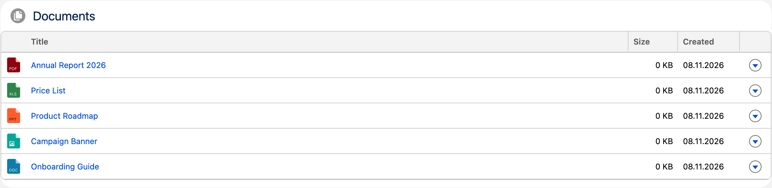
## Read on Medium
**[How to build a Content Document Datatable with Apex & LWC](https://medium.com/capgemini-salesforce-architects/how-to-build-a-content-document-datatable-with-apex-lwc-f68d5367932c)**
## Attributes
| Name | Type | Default | Description |
| -------------------- | ------- | ---------------- | ---------------------------------------------------------------------------------------------------------------------------------------------------------------------------------------------------------------------------------------------------------------- |
| card-icon | string | 'standard:file' | If show card option is active, the card icon is displayed in the header before the card title. It should contain the SLDS name of the icon. Specify the name in the format 'standard:file' where 'standard' is the category and 'case' the icon to be displayed. |
| card-title | string | 'Document Table' | If show card option is active, the card title can include text and is displayed in the header above the table. |
| folder | string | null | Folder name within Files library. |
| library | string | 'Documents' | Files library name. |
| record-id | string | null | If the component is used on a lightning record page, the page sets the property to the id of the current record. |
| show-card | boolean | false | If present, the table is wrapped in a lightning card to fit better into the overall page layout. |
| show-delete-action | boolean | false | If present, the last column contains a delete file action. |
| show-download-action | boolean | false | If present, the last column contains a download file action. |
| show-view-action | boolean | false | If present, the last column contains a view file action. |
## Usage
```html
```
All attributes are also configurable in the Lightning App Builder, so no code is required to use the component.
## Custom Labels
The texts users see are Custom Labels, so they can be translated in Setup with the Translation Workbench. Copy them together with the component.
| Name | Value |
| ----------------------------------------- | ---------------------- |
| ContentDocumentTable_Created | Created |
| ContentDocumentTable_Delete | Delete |
| ContentDocumentTable_Download | Download |
| ContentDocumentTable_ErrorDeletingFile | Error deleting file |
| ContentDocumentTable_ErrorDownloadingFile | Error downloading file |
| ContentDocumentTable_FileDeleted | File deleted |
| ContentDocumentTable_Loading | Loading |
| ContentDocumentTable_Size | Size |
| ContentDocumentTable_Success | Success |
| ContentDocumentTable_Title | Title |
| ContentDocumentTable_View | View |
| ErrorUtils_UnknownError | Unknown error |
## Component Dependencies
| Name | Type | Description |
| ----------------------------- | ---- | --------------------------------------------------------------------------------------------- |
| contentDocumentIcon | LWC | Custom datatable cell type to display the appropriate icon based on the file type. |
| contentDocumentPreview | LWC | Custom datatable cell type that is used to display a file preview when clicking on the title. |
| contentDocumentTableExtension | LWC | Custom extension of the standard LWC datatable to support individual table cell types. |
| ContentDocumentController | Apex | Controller class for retrieving content documents from files library. |
| ContentDocumentControllerTest | Apex | Test class for ContentDocumentController. |
| errorUtils | LWC | Shared functions to read error messages and show error toasts. |
---
---
url: /awesome-lwc-collection/components/visualforceToPdf.md
description: A simple utility for displaying Visualforce based PDF documents.
---
# Visualforce To PDF
A simple utility for displaying Visualforce based PDF documents.
**Type:** Utility
**Available in:** App Page · Home Page · Record Page · Flow Screen
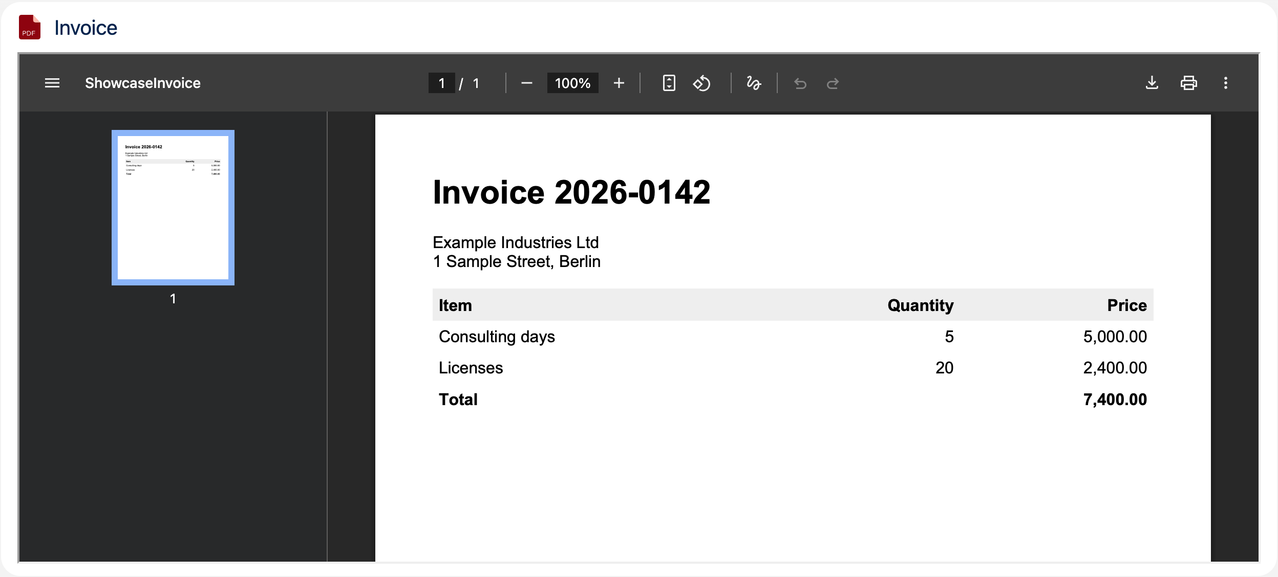
## Attributes
| Name | Type | Default | Description |
| ---------- | ------- | ------------- | -------------------------------------------------------------------------------------------------------------------------------------------------------------------------------------------------------------------------------------------------------------- |
| card-icon | string | 'doctype:pdf' | If show card option is active, the card icon is displayed in the header before the card title. It should contain the SLDS name of the icon. Specify the name in the format 'utility:down' where 'utility' is the category and 'down' the icon to be displayed. |
| card-title | string | '' | If show card option is active, the card title can include text and is displayed in the header above the PDF viewer. |
| height | string | '500px' | Specifies the height of the PFD viewer. Default height is 500 pixels. |
| show-card | boolean | false | If present, the PDF viewer is wrapped in a lightning card to fit better into the overall page layout. |
| url | string | '' | Specifies the Visualforce Page address of the document to be displayed. |
| width | string | '100%' | Specifies the width of the PFD viewer. Default width is 100 percent. |
## Usage
```html
```
Wrap it in a Lightning Card to match the cards around it on a page:
```html
```
The url attribute takes the relative address of a Visualforce page that is rendered as PDF (`renderAs="pdf"`).
## Custom Labels
The texts users see are Custom Labels, so they can be translated in Setup with the Translation Workbench. Copy them together with the component.
| Name | Value |
| --------------------------- | ------------------ |
| VisualforceToPdf_FrameTitle | Visualforce to PDF |
---
---
url: /awesome-lwc-collection/components/customMapView.md
description: Configurable map component for displaying locations via Google Maps API.
---
# Custom Map View
Configurable map component for displaying locations via Google Maps API.
**Type:** Component
**Available in:** Record Page
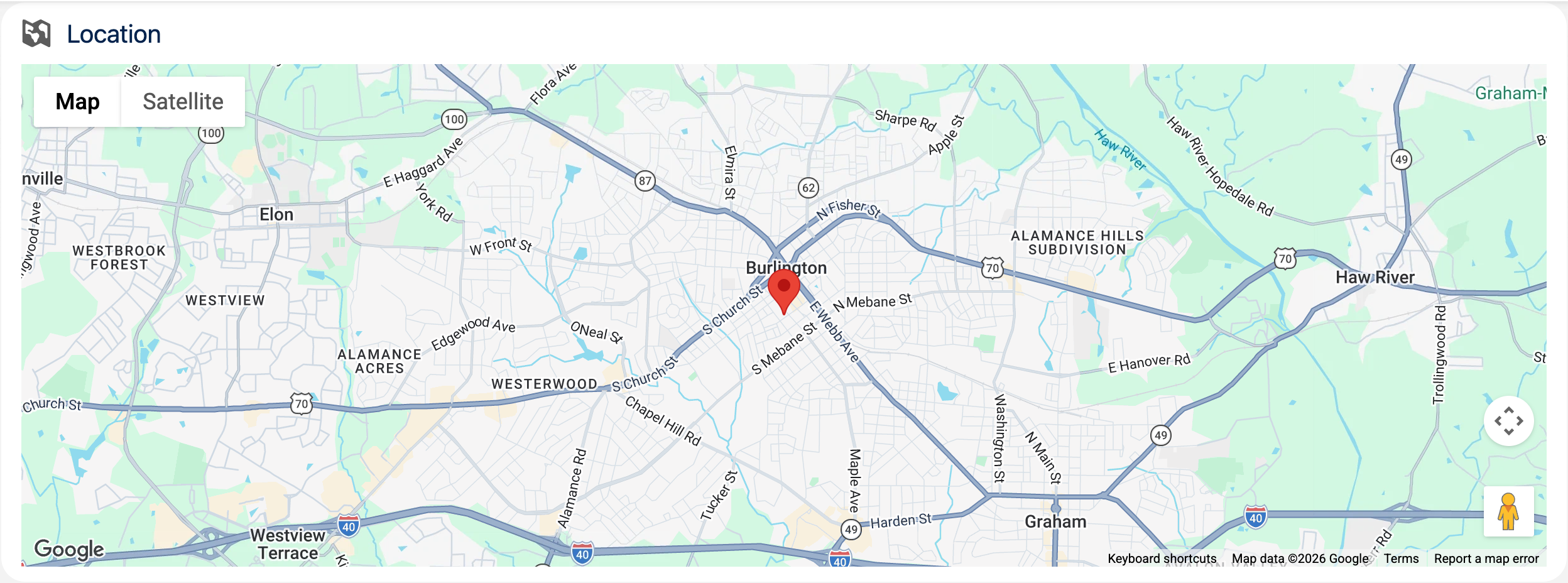
## Read on Medium
**[How To Create a Generic and Reusable Custom Map View With LWC](https://betterprogramming.pub/how-to-create-a-generic-and-reusable-custom-map-view-with-lwc-4bfe38a27785)**
## Attributes
| Name | Type | Default | Description |
| ----------------- | ------- | ------------------ | -------------------------------------------------------------------------------------------------------------------------------------------------------------------------------------------------------------------------------------------------------------- |
| record-id | string | | If the component is used on a lightning record page, the page sets the property to the id of the current record. |
| object-api-name | string | | If the component is used on a lightning record page, the page sets the property to the API name of the current object. |
| show-card | boolean | false | If present, the map is wrapped in a lightning card to fit better into the overall page layout. |
| card-icon | string | 'utility:location' | If show card option is active, the card icon is displayed in the header before the card title. It should contain the SLDS name of the icon. Specify the name in the format 'utility:down' where 'utility' is the category and 'down' the icon to be displayed. |
| card-title | string | '' | If show card option is active, the card title can include text and is displayed in the header above the map. |
| height | string | '400px' | Height of the map component in percent or pixels. The default is 400px. |
| width | string | '100%' | Width of the map component in percent or pixels. The default is 100%. |
| list-view | string | 'auto' | Displays or hides the list of locations. Valid values are visible, hidden, or auto. |
| zoom-level | string | | Supports zoom levels from 1 to 20. If not specified, the component calculates a zoom level to accommodate the markers in the map. |
| title-field | string | 'Name' | API name of the field that contains the location title. The default is the Name field. |
| city-field | string | | API name of the field that contains the city. |
| country-field | string | | API name of the field that contains the country. |
| postal-code-field | string | | API name of the field that contains the postal code. |
| state-field | string | | API name of the field that contains the state. |
| street-field | string | | API name of the field that contains the street. |
## Usage
```html
```
The component is designed for Lightning record pages: drop it onto the page in the Lightning App Builder and map the address fields of the current object. The record-id and object-api-name attributes are set automatically by the record page.
## Custom Labels
The texts users see are Custom Labels, so they can be translated in Setup with the Translation Workbench. Copy them together with the component.
| Name | Value |
| ----------------------------------- | --------------------------- |
| CustomMapView_ErrorLoadingLocations | Error loading location data |
| ErrorUtils_UnknownError | Unknown error |
## Component Dependencies
| Name | Type | Description |
| ---------- | ---- | -------------------------------------------------------------- |
| errorUtils | LWC | Shared functions to read error messages and show error toasts. |
---
---
url: /awesome-lwc-collection/components/graphqlMapView.md
description: >-
Configurable map component for displaying locations via Google Maps API using
LWC GraphQL Wire Adapter.
---
# GraphQL Map View
Configurable map component for displaying locations via Google Maps API using LWC GraphQL Wire Adapter.
**Type:** Component
**Available in:** Record Page
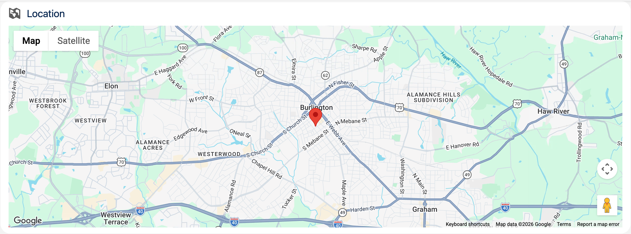
## Read on Medium
**[Replace Apex with GraphQL in Your Salesforce UI Architecture](https://medium.com/capgemini-salesforce-architects/replace-apex-with-graphql-in-your-salesforce-ui-architecture-62693ff40f5b)**
## Attributes
| Name | Type | Default | Description |
| ----------------- | ------- | ------------------ | -------------------------------------------------------------------------------------------------------------------------------------------------------------------------------------------------------------------------------------------------------------- |
| record-id | string | | If the component is used on a lightning record page, the page sets the property to the id of the current record. |
| object-api-name | string | | If the component is used on a lightning record page, the page sets the property to the API name of the current object. |
| show-card | boolean | false | If present, the map is wrapped in a lightning card to fit better into the overall page layout. |
| card-icon | string | 'utility:location' | If show card option is active, the card icon is displayed in the header before the card title. It should contain the SLDS name of the icon. Specify the name in the format 'utility:down' where 'utility' is the category and 'down' the icon to be displayed. |
| card-title | string | '' | If show card option is active, the card title can include text and is displayed in the header above the map. |
| height | string | '400px' | Height of the map component in percent or pixels. The default is 400px. |
| width | string | '100%' | Width of the map component in percent or pixels. The default is 100%. |
| list-view | string | 'auto' | Displays or hides the list of locations. Valid values are visible, hidden, or auto. |
| zoom-level | string | | Supports zoom levels from 1 to 20. If not specified, the component calculates a zoom level to accommodate the markers in the map. |
| title-field | string | 'Name' | API name of the field that contains the location title. The default is the Name field. |
| city-field | string | | API name of the field that contains the city. |
| country-field | string | | API name of the field that contains the country. |
| postal-code-field | string | | API name of the field that contains the postal code. |
| state-field | string | | API name of the field that contains the state. |
| street-field | string | | API name of the field that contains the street. |
## Usage
```html
```
The component is designed for Lightning record pages: drop it onto the page in the Lightning App Builder and map the address fields of the current object. The record-id and object-api-name attributes are set automatically by the record page.
## Custom Labels
The texts users see are Custom Labels, so they can be translated in Setup with the Translation Workbench. Copy them together with the component.
| Name | Value |
| ------------------------------------ | --------------------------- |
| ErrorUtils_UnknownError | Unknown error |
| GraphqlMapView_ErrorLoadingLocations | Error loading location data |
## Component Dependencies
| Name | Type | Description |
| ---------- | ---- | -------------------------------------------------------------- |
| errorUtils | LWC | Shared functions to read error messages and show error toasts. |
---
---
url: /awesome-lwc-collection/components/orgChartViewer.md
description: >-
An interactive organization chart with search, expand/collapse and PNG export,
powered by the d3-org-chart library. It loads the records of any object with a
parent field itself, e.g. users and their managers, takes your own hierarchy
via the records attribute, or shows a small demo dataset.
---
# Org Chart Viewer
An interactive organization chart with search, expand/collapse and PNG export, powered by the [d3-org-chart](https://github.com/bumbeishvili/org-chart) library. It loads the records of any object with a parent field itself, e.g. users and their managers, takes your own hierarchy via the `records` attribute, or shows a small demo dataset.
**Type:** Component
**Available in:** App Page · Home Page · Record Page
## Attributes
| Name | Type | Default | Description |
| --------------------- | ------ | ------- | ---------------------------------------------------------------------------------------------------------------------------------------------------------------------- |
| image-field | string | | API name of the field with an image URL shown instead of the initials, e.g. 'SmallPhotoUrl'. |
| name-field | string | 'Name' | API name of the field shown as the name of a node. |
| chart-object-api-name | string | | API name of the object whose records the chart loads, e.g. 'User' or 'Contact'. Used together with parent-field-api-name; records set from outside take precedence. |
| parent-field-api-name | string | | API name of the field with the parent record, e.g. 'ManagerId', 'ReportsToId' or 'ParentId'. |
| record-id | string | | Id of the record of the record page, filled automatically there. |
| records | Array | \[] | Flat list of records to render as a tree. Each record needs an id (or Id) and a parentId (or ManagerId), plus a name and title. |
| root-record-id | string | | Id of the record the chart starts from. Without it, the chart starts from the record of the record page, if it is among the loaded records, or else shows all of them. |
| title-field | string | | API name of the field shown below the name, e.g. 'Title'. |
## Usage
Show the users of the org with their managers, photos and titles:
```html
```
In the Lightning App Builder, set the same values in the properties of the component, e.g. Contact with ReportsToId or Account with ParentId. On a record page of that object, the chart starts from the record of the page; Root Record Id sets another starting point.
Or pass your own hierarchy:
```html
```
### Loading records
* The records are loaded with GraphQL, so no Apex is involved and users only see records and fields they have access to. Invalid object or field names are ignored instead of being sent.
* The chart needs one root. Records whose parent isn't loaded are roots; several roots get a shared top node named after the object, e.g. "Users". Records that can't be reached from a root, like those in a cycle, are left out.
* At most 2000 records are loaded; if there are more, the chart says so. Set a Root Record Id to show a part of a larger hierarchy.
* While the records load, a spinner shows; without records the chart says so, and errors are shown above it.
* A click on a loaded record, or Enter when it has the keyboard focus, opens its record page; the shared top node, the demo data and records set from outside don't navigate.
* Images are shown only from `https://` or relative URLs. The PNG export shows the initials instead, because Salesforce doesn't allow reading images from its file domain for the export.
## Events
| Name | Detail | Description |
| ---------- | --------------------------------------------- | ------------------------------------------------------------------------------------------------------------------------------------------------------------------------- |
| nodeselect | `{ record }` - the record of the clicked node | Fired whenever a node in the chart is clicked, so a parent component can react to the selection. It is cancelable: `preventDefault()` keeps a loaded record from opening. |
## Custom Labels
The texts users see are Custom Labels, so they can be translated in Setup with the Translation Workbench. Copy them together with the component.
| Name | Value |
| -------------------------------- | ------------------------------------- |
| ErrorAlert_Error | Error |
| ErrorUtils_UnknownError | Unknown error |
| OrgChartViewer_CollapseAll | Collapse All |
| OrgChartViewer_ExpandAll | Expand All |
| OrgChartViewer_ExportPng | Export PNG |
| OrgChartViewer_FitToScreen | Fit to Screen |
| OrgChartViewer_LibraryNotLoaded | Failed to load chart library: {0} |
| OrgChartViewer_Loading | Loading the org chart... |
| OrgChartViewer_NodeCount | Showing {0} of {1} nodes |
| OrgChartViewer_NoRecords | No records found. |
| OrgChartViewer_OnlyFirstRecords | Only the first {0} records are shown. |
| OrgChartViewer_OpenRecord | Open {0} |
| OrgChartViewer_RecordsNotLoaded | The records could not be loaded: {0} |
| OrgChartViewer_Search | Search |
| OrgChartViewer_SearchPlaceholder | Search by name... |
| OrgChartViewer_Title | Org Chart Viewer |
| OrgChartViewer_Unknown | Unknown |
## Component Dependencies
| Name | Type | Description |
| ---------- | --------------- | --------------------------------------------------------------------------------------------- |
| d3orgchart | Static Resource | d3 v7 + d3-flextree + d3-org-chart - Libraries for rendering interactive organization charts. |
| errorAlert | LWC | Inline alert that shows error messages to the user. |
| errorUtils | LWC | Shared functions to read error messages and show error toasts. |
| labelUtils | LWC | Shared function to fill the placeholders of Custom Labels. |
---
---
url: /awesome-lwc-collection/components/render3DElementsThreeJS.md
description: >-
A 3D viewer for glTF and GLB models using Three.js. Without a model, it shows
a rotating crate.
---
# Render 3D Elements
A 3D viewer for glTF and GLB models using Three.js. Without a model, it shows a rotating crate.
**Type:** Component
**Available in:** App Page · Home Page · Record Page · Flow Screen
## Read on Medium
**[How to Render 3D Elements with Lightning Web Components](https://medium.com/capgemini-salesforce-architects/how-to-render-3d-elements-with-lightning-web-components-7f603129d5f0)**
## Attributes
| Name | Type | Default | Description |
| ---------------- | ------- | ----------------- | -------------------------------------------------------------------------------------------------------------------------------------------------------------------------------------------------------------------------------------------------------------- |
| background-color | string | '' | Background color of the scene as a CSS color, e.g. '#f3f3f3' or 'white'. Without it, the background is black. |
| card-icon | string | 'custom:custom57' | If show card option is active, the card icon is displayed in the header before the card title. It should contain the SLDS name of the icon. Specify the name in the format 'utility:down' where 'utility' is the category and 'down' the icon to be displayed. |
| card-title | string | '3D Viewer' | If show card option is active, the card title can include text and is displayed in the header above the viewer. |
| disable-rotation | boolean | false | If present, the model doesn't rotate on its own. |
| enable-controls | boolean | false | If present, the model can be rotated with the mouse or touch, zoomed with the wheel and moved with the right mouse button. |
| height | string | '400px' | Height of the viewer, e.g. '400px'. The width follows the container. |
| model-url | string | '' | URL of a glTF or GLB model, e.g. of a static resource: '/resource/carModel'. Without it, the viewer shows a crate. |
| show-card | boolean | false | If present, the viewer is wrapped in a lightning card to fit better into the overall page layout. |
## Usage
```html
```
Upload the model as a static resource and set its URL, `/resource/`, in the Model URL property of the Lightning App Builder. The viewer centers the model, lights it and moves the camera so that the whole model is visible. With enable-controls, the mouse pointer turns into a hand over the model. If Three.js or the model cannot be loaded, or the browser has no WebGL, it shows an error message.
* Use a GLB file, or a glTF file with its `.bin` and textures zipped into one static resource, e.g. `/resource/carModel/scene.gltf`. A glTF with its data embedded as `data:` URIs doesn't load, because the Content Security Policy of Lightning blocks them.
* Files attached to a record can't be shown: Salesforce serves them from its file domain, which the browser doesn't allow the viewer to read.
### Building Three.js
The `threejs` static resource is Three.js 0.186.1 bundled with `GLTFLoader` and `OrbitControls` into one script that sets the global `THREE`. To update it, install `three` and `esbuild` outside the project and bundle this entry file:
```js
import * as three from 'three';
import { GLTFLoader } from 'three/examples/jsm/loaders/GLTFLoader.js';
import { OrbitControls } from 'three/examples/jsm/controls/OrbitControls.js';
globalThis.THREE = { ...three, GLTFLoader, OrbitControls };
```
```bash
npx esbuild entry.js --bundle --minify --format=iife --target=es2020 --legal-comments=none --outfile=threejs.js
```
## Custom Labels
The texts users see are Custom Labels, so they can be translated in Setup with the Translation Workbench. Copy them together with the component.
| Name | Value |
| ------------------------------------------ | ----------------------------------- |
| ErrorAlert_Error | Error |
| ErrorUtils_UnknownError | Unknown error |
| Render3DElementsThreeJS_ErrorWithoutReason | {0}. |
| Render3DElementsThreeJS_ErrorWithReason | {0}: {1} |
| Render3DElementsThreeJS_ModelNotLoaded | The 3D model could not be loaded |
| Render3DElementsThreeJS_SceneNotDisplayed | The 3D scene could not be displayed |
## Component Dependencies
| Name | Type | Description |
| ------------- | --------------- | ------------------------------------------------------------------------------------------------------- |
| labelUtils | LWC | Shared function to fill the placeholders of Custom Labels. |
| threejs | Static Resource | Three.js 0.186.1 with GLTFLoader and OrbitControls - Lightweight, cross-browser 3D library using WebGL. |
| crateMaterial | Static Resource | Texture of the crate shown without a model. |
| errorAlert | LWC | Inline alert that shows error messages to the user. |
| errorUtils | LWC | Shared functions to read error messages and show error toasts. |
---
---
url: /awesome-lwc-collection/components/signaturePad.md
description: >-
A canvas-based signature capture component with mouse and touch support. Works
on desktop and mobile devices without any external libraries.
---
# Signature Pad
A canvas-based signature capture component with mouse and touch support. Works on desktop and mobile devices without any external libraries.
**Type:** Component
**Available in:** App Page · Home Page · Record Page · Flow Screen
## Attributes
| Name | Type | Default | Description |
| ------------------- | ------- | --------- | ---------------------------------------------------------------------------------------------------------- |
| pen-color | string | '#000000' | The initial pen color. |
| stroke-width | number | 2 | The initial stroke width in pixels. |
| height | string | '' | The height of the signature area, for example '400px'. By default it depends on the screen size. |
| required | boolean | false | If present, a signature is required by the validate method. |
| record-id | string | | The record to save the signature to. Set automatically on record pages. |
| save-to-record | boolean | false | If present, a button saves the signature as a file on the record given by record-id. |
| signature-data-url | string | | Read-only. The signature as a PNG data URL, empty while the pad is empty. Also available as a Flow output. |
| content-document-id | string | | Read-only. The id of the saved file. Empties when the signature changes. Also available as a Flow output. |
| validate | method | | Checks the required attribute for Flow screens. Returns isValid and errorMessage. |
## Usage
```html
```
Saving creates the file directly through Lightning Data Service, so no Apex is involved and the permissions of the user apply. Users need access to the record and permission to create files.
## Events
| Name | Detail | Description |
| --------------- | ----------------------- | ----------------------------------------------------------------------------------------------------------------------------------------------------- |
| signaturechange | `{ dataUrl, isEmpty }` | Fired after every stroke and when the pad is cleared. dataUrl contains the signature as a PNG data URL and is an empty string while the pad is empty. |
| signaturesave | `{ contentDocumentId }` | Fired after the signature was saved as a file on the record. |
## Custom Labels
The texts users see are Custom Labels, so they can be translated in Setup with the Translation Workbench. Copy them together with the component.
| Name | Value |
| ----------------------------- | ----------------------------- |
| ErrorUtils_UnknownError | Unknown error |
| SignaturePad_Clear | Clear |
| SignaturePad_Download | Download |
| SignaturePad_ErrorSaving | Error saving the signature |
| SignaturePad_FileTitle | Signature |
| SignaturePad_PenColor | Pen Color |
| SignaturePad_Placeholder | Draw your signature here |
| SignaturePad_ProvideSignature | Please provide a signature. |
| SignaturePad_Save | Save |
| SignaturePad_Saved | The signature has been saved. |
| SignaturePad_SaveSignature | Please save your signature. |
| SignaturePad_Saving | Saving |
| SignaturePad_StrokeWidth | Stroke Width ({0}px) |
| SignaturePad_Success | Success |
| SignaturePad_Title | Signature Pad |
| SignaturePad_Undo | Undo |
## Component Dependencies
| Name | Type | Description |
| ---------- | ---- | -------------------------------------------------------------- |
| errorUtils | LWC | Shared functions to read error messages and show error toasts. |
| labelUtils | LWC | Shared function to fill the placeholders of Custom Labels. |
---
---
url: /awesome-lwc-collection/components/takeUserProfilePicture.md
description: >-
A simple component that makes use of the Media Capture and Streams API to
allow Salesforce users to take a new photo with their device's camera and use
it to update their personal user profile.
---
# Take User Profile Picture
A simple component that makes use of the Media Capture and Streams API to allow Salesforce users to take a new photo with their device's camera and use it to update their personal user profile.
**Type:** Component
**Available in:** App Page · Home Page · Record Page · Flow Screen
## Read on Medium
**[Allow your Salesforce Users to take a new Profile Picture](https://medium.com/gitconnected/allow-your-salesforce-users-to-take-a-new-profile-picture-201b45de9a6c)**
## Attributes
| Name | Type | Default | Description |
| -------------- | ------ | ------- | ----------------------------------------------------------------------------------- |
| default-camera | string | 'front' | The camera to start with, front or back. Devices with only one camera use that one. |
## Usage
```html
```
The component is self-contained: it asks for camera access, takes a photo and updates the profile picture of the current user. To use the camera for something else, see Camera Capture.
## Custom Labels
The texts users see are Custom Labels, so they can be translated in Setup with the Translation Workbench. Copy them together with the component.
| Name | Value |
| ---------------------------------------- | -------------------------------------------------------------------------------- |
| CameraCapture_CapturePhoto | Capture Photo |
| CameraCapture_Error | Error |
| CameraCapture_ErrorAccessingCamera | Error accessing camera |
| CameraCapture_NotSupported | getUserMedia is not supported in this browser |
| CameraCapture_StartCamera | Start Camera |
| CameraCapture_StopCamera | Stop Camera |
| ErrorUtils_UnknownError | Unknown error |
| TakeUserProfilePicture_CapturePhoto | Capture Photo |
| TakeUserProfilePicture_ErrorSaving | Error saving the profile picture |
| TakeUserProfilePicture_NewProfilePreview | Preview of the new profile |
| TakeUserProfilePicture_StartCamera | Start Camera |
| TakeUserProfilePicture_StopCamera | Stop Camera |
| TakeUserProfilePicture_Success | Success |
| TakeUserProfilePicture_Title | Take User Profile Picture |
| TakeUserProfilePicture_Updated | Profile picture has been updated, it takes some time until the change is visible |
| TakeUserProfilePicture_UpdateProfile | Update Profile Picture |
## Component Dependencies
| Name | Type | Description |
| -------------------------------- | ---- | -------------------------------------------------------------- |
| UserProfilePictureController | Apex | Controller class for updating the user's profile picture. |
| UserProfilePictureControllerTest | Apex | Test class for UserProfilePictureController. |
| errorUtils | LWC | Shared functions to read error messages and show error toasts. |
| cameraCapture | LWC | Building block for the live camera view and taking photos. |
---
---
url: /awesome-lwc-collection/components/cameraCapture.md
description: >-
A live camera view that takes photos with the Media Capture and Streams API,
to build into your own components.
---
# Camera Capture
A live camera view that takes photos with the Media Capture and Streams API, to build into your own components.
**Type:** Building Block
**Available in:** Not exposed in the Lightning App Builder - intended to be embedded in other components.
## Attributes
| Name | Type | Default | Description |
| ------------- | ------- | ------- | -------------------------------------------------------------------------------------------------------------- |
| camera | string | 'front' | The camera to ask for, front or back. Devices with only one camera use that one. |
| hide-controls | boolean | false | If present, the buttons are hidden, so that a parent can use its own with the start, stop and capture methods. |
| start | method | | Starts the camera. A running camera is stopped first. |
| stop | method | | Stops the camera. Does nothing if it isn't running. |
| capture | method | | Takes a photo and fires the capture event. Does nothing if the camera isn't running. |
## Events
| Name | Detail | Description |
| ------- | ------------- | --------------------------------------------------------------------------- |
| capture | `{ dataUrl }` | Fired when a photo was taken. dataUrl contains the photo as a PNG data URL. |
## Usage
```html
```
What happens with the photo is up to you. Take User Profile Picture uses it for the profile of the current user, and the camera stops by itself when the component is removed or hidden, for example when the user moves on to another page in Lightning.
## Custom Labels
The texts users see are Custom Labels, so they can be translated in Setup with the Translation Workbench. Copy them together with the component.
| Name | Value |
| ---------------------------------- | --------------------------------------------- |
| CameraCapture_CapturePhoto | Capture Photo |
| CameraCapture_Error | Error |
| CameraCapture_ErrorAccessingCamera | Error accessing camera |
| CameraCapture_NotSupported | getUserMedia is not supported in this browser |
| CameraCapture_StartCamera | Start Camera |
| CameraCapture_StopCamera | Stop Camera |
| ErrorUtils_UnknownError | Unknown error |
## Component Dependencies
| Name | Type | Description |
| ---------- | ---- | -------------------------------------------------------------- |
| errorUtils | LWC | Shared functions to read error messages and show error toasts. |
---
---
url: /awesome-lwc-collection/components/qrCodeGenerator.md
description: >-
A basic QR Code Generator with optional logo overlay using the external
QRCode.js library.
---
# QR Code Generator
A basic QR Code Generator with optional logo overlay using the external QRCode.js library.
**Type:** Component
**Available in:** App Page · Home Page · Record Page · Flow Screen
## Read on Medium
**[How to Generate QR Codes with Lightning Web Components](https://medium.com/capgemini-salesforce-architects/how-to-generate-qr-codes-with-lightning-web-components-4d41dd09f3c1)**
## Attributes
| Name | Type | Default | Description |
| ------------------- | ------- | --------- | ---------------------------------------------------------------------------------------------- |
| color-dark | string | '#000000' | The initial color of the dark modules of the code, as any CSS color. Users can change it. |
| color-light | string | '#ffffff' | The initial color of the light modules of the code, as any CSS color. Users can change it. |
| logo-url | string | | The logo to show in the code. An image from another domain needs to allow this with CORS. |
| record-id | string | | The record to save the code to. Set automatically on record pages. |
| save-to-record | boolean | false | If present, a button saves the code as a file on the record given by record-id. |
| size | number | 256 | The displayed size of the code in pixels. The image has at least a resolution of 1024 pixels. |
| qr-code-data-url | string | | Read-only. The code as a PNG data URL, empty without a code. Also available as a Flow output. |
| content-document-id | string | | Read-only. The id of the saved file. Empties with a new code. Also available as a Flow output. |
## Events
| Name | Detail | Description |
| -------------- | ----------------------- | ------------------------------------------------------- |
| qrcodegenerate | `{ dataUrl, value }` | Fired when a code was generated. |
| qrcodesave | `{ contentDocumentId }` | Fired after the code was saved as a file on the record. |
## Usage
```html
```
Users enter a target URL, optionally upload a logo and generate the code. The URL has to be complete, including `https://`.
Users can also change both colors. A hint appears if the contrast is low or the code is inverted, because such a code may be hard to scan. It doesn't block generating.
The image includes the empty border that scanners need, in the light color, so a saved code can be printed or placed anywhere.
Saving creates the file directly through Lightning Data Service, so no Apex is involved and the permissions of the user apply.
## Custom Labels
The texts users see are Custom Labels, so they can be translated in Setup with the Translation Workbench. Copy them together with the component.
| Name | Value |
| -------------------------------- | --------------------------------------------- |
| ErrorAlert_Error | Error |
| ErrorUtils_UnknownError | Unknown error |
| QrCodeGenerator_DarkColor | Dark Color |
| QrCodeGenerator_EnterUrl | Please enter a URL. |
| QrCodeGenerator_ErrorSaving | Error saving the QR code |
| QrCodeGenerator_FileNotRead | Failed to read the selected file. |
| QrCodeGenerator_FileTitle | QR Code |
| QrCodeGenerator_Generate | Generate QR Code |
| QrCodeGenerator_GeneratedCode | Generated QR Code |
| QrCodeGenerator_Generating | Generating... |
| QrCodeGenerator_GenerationFailed | Failed to generate QR code: {0} |
| QrCodeGenerator_HardToScan | These colors may be hard to scan. |
| QrCodeGenerator_LibraryMissing | QR code library not loaded. Please try again. |
| QrCodeGenerator_LibraryNotLoaded | Failed to load QR code library: {0} |
| QrCodeGenerator_LightColor | Light Color |
| QrCodeGenerator_Logo | Logo (optional) |
| QrCodeGenerator_LogoPreview | Logo preview |
| QrCodeGenerator_RemoveLogo | Remove logo |
| QrCodeGenerator_Save | Save |
| QrCodeGenerator_Saved | The QR code has been saved. |
| QrCodeGenerator_Success | Success |
| QrCodeGenerator_TargetUrl | Target URL |
| QrCodeGenerator_Title | QR Code Generator |
| QrCodeGenerator_UrlPlaceholder | https://example.com |
## Component Dependencies
| Name | Type | Description |
| ---------- | --------------- | ------------------------------------------------------------------------ |
| labelUtils | LWC | Shared function to fill the placeholders of Custom Labels. |
| qrcodejs | Static Resource | QRCode.js - JavaScript Library for generating QRCodes with Logo Support. |
| errorAlert | LWC | Inline alert that shows error messages to the user. |
| errorUtils | LWC | Shared functions to read error messages and show error toasts. |
---
---
url: /awesome-lwc-collection/components/customCarousel.md
description: A simple custom carousel with different configuration options.
---
# Custom Carousel
A simple custom carousel with different configuration options.
**Type:** Component
**Available in:** App Page · Home Page · Record Page · Flow Screen
## Attributes
| Name | Type | Default | Description |
| ----------------------- | ------- | --------------- | -------------------------------------------------------------------------------------------------------------------------------------------------------------------------------------------------------------------------------------------------------------- |
| aspect-ratio | string | '' | Set a fixed aspect ratio for the slides, e.g. '16:9' or '4/3'. The images then fill the slides and are cropped where needed. Takes precedence over custom-height. |
| auto-scroll | boolean | false | If present, automatic slide scrolling will be enabled. |
| card-icon | string | 'utility:image' | If show card option is active, the card icon is displayed in the header before the card title. It should contain the SLDS name of the icon. Specify the name in the format 'utility:down' where 'utility' is the category and 'down' the icon to be displayed. |
| card-title | string | '' | If show card option is active, the card title can include text and is displayed in the header above the carousel. |
| custom-height | string | '' | Set maximum height of the carousel in percent or pixels. |
| custom-width | string | '600px' | Set maximum width of the carousel in percent or pixels. |
| hide-navigation-buttons | boolean | false | If present, the "next" and "prev" navigation buttons will be hidden. |
| hide-navigation-dots | boolean | false | If present, the navigation dots below the carousel will be hidden. |
| hide-slide-number | boolean | false | If present, the current slide number will be hidden. |
| hide-slide-text | boolean | false | If present, the text overlay with heading and description will be hidden. |
| record-id | string | | The Id of the record whose images are shown when use-record-files is set. Filled automatically on record pages. |
| scroll-duration | number | 5000 | Set the duration in milliseconds after which the next slide should be displayed. |
| show-card | boolean | false | If present, the carousel is wrapped in a lightning card to fit better into the overall page layout. |
| show-thumbnails | boolean | false | If present, small previews of the images replace the navigation dots. |
| slides-data | Array | | JSON array of slides that are displayed in the custom carousel. Each slide has the following attributes: image, heading and description, and optionally link and linkLabel for a call to action. Ignored when use-record-files shows the images of a record. |
| transition | string | 'fade' | Set how the carousel moves to another slide: 'fade' blends the new slide in, 'slide' moves it in from the side. Both are switched off when the user prefers reduced motion. |
| use-record-files | boolean | false | If present, the images attached to the record are the slides instead of slides-data. Works where record-id is set, e.g. on record pages. |
### Example slides-data JSON array
```
[
{
"image": "https://example.com/image1.jpg",
"heading": "Slide 1",
"description": "Description for slide 1",
"link": "https://example.com/offer",
"linkLabel": "See the offer"
},
{
"image": "https://example.com/image2.jpg",
"heading": "Slide 2",
"description": "Description for slide 2"
},
{
"image": "https://example.com/image3.jpg",
"heading": "Slide 3",
"description": "Description for slide 3"
}
]
```
## Usage
```html
```
With a fixed aspect ratio, all slides have the same size, whatever the size of their images, and the carousel can sit in a Lightning Card:
```html
```
When adding the component to a page in the Lightning App Builder, paste a slides JSON array like the example above into the slides-data property.
If the slides-data value is a string that is not valid JSON, the component shows an error message instead of the slides. Without slides, the navigation is hidden.
Changes to auto-scroll and scroll-duration take effect immediately, and new slides-data starts again at the first slide.
With the slide transition, every slide keeps the height of its image, so the carousel is as high as its highest image. For slides of the same size, set an aspect-ratio.
### Call to action
A slide with a `link` shows a button with its `linkLabel`, or "Learn more" without one, below the description. Only `http://`, `https://` and relative links like `/lightning/page/home` are shown, other links are ignored. The button is part of the text overlay, so hide-slide-text hides it too.
### Images of a record
On a record page, set use-record-files to show the images attached to the record (PNG, JPEG, GIF and WebP) instead of slides-data, with the file title as description. They are loaded with GraphQL, so no Apex is involved and users only see files they have access to. Without images, the carousel says so; if they can't be loaded, it shows an error.
```html
```
In a Flow screen, pass the record Id to the Record ID input.
## Keyboard, touch and screen readers
* The left and right arrow keys switch slides while the focus is inside the carousel. On a dot, the focus moves along with the slide.
* On touch screens, swipe left or right to switch slides. The mouse can drag in the same way.
* With auto-scroll, a play/pause button next to the dots stops and starts the slide show. The slide show pauses while the mouse is over the carousel, and it stops when the keyboard focus moves into it, until the user starts it again.
* Screen readers announce the carousel as a carousel and each slide with its position, e.g. "2 of 3". When the user switches slides, the new slide is announced; automatic changes are not.
## Custom Labels
The texts users see are Custom Labels, so they can be translated in Setup with the Translation Workbench. Copy them together with the component.
| Name | Value |
| -------------------------------------- | ---------------------------------------------------------------------------- |
| CustomCarousel_Announcement | Slide {0} of {1} |
| CustomCarousel_AnnouncementWithHeading | Slide {0} of {1}: {2} |
| CustomCarousel_Carousel | carousel |
| CustomCarousel_ImageCarousel | Image carousel |
| CustomCarousel_ImagesNotLoaded | The images of this record could not be loaded: {0} |
| CustomCarousel_InvalidSlides | The slides could not be displayed because the slides data is not valid JSON. |
| CustomCarousel_LearnMore | Learn more |
| CustomCarousel_NextSlide | Next slide |
| CustomCarousel_NoImages | No images are attached to this record. |
| CustomCarousel_PreviousSlide | Previous slide |
| CustomCarousel_ShowSlide | Show slide {0} |
| CustomCarousel_Slide | slide |
| CustomCarousel_SlidePosition | {0} of {1} |
| CustomCarousel_StartSlideShow | Start automatic slide show |
| CustomCarousel_StopSlideShow | Stop automatic slide show |
| ErrorAlert_Error | Error |
| ErrorUtils_UnknownError | Unknown error |
## Component Dependencies
| Name | Type | Description |
| ---------- | ---- | -------------------------------------------------------------- |
| errorAlert | LWC | Inline alert that shows error messages to the user. |
| errorUtils | LWC | Shared functions to read error messages and show error toasts. |
| labelUtils | LWC | Shared function to fill the placeholders of Custom Labels. |
---
---
url: /awesome-lwc-collection/components/dragAndDrop.md
description: A drag and drop building block based on the HTML Drag and Drop API.
---
# Drag & Drop
A drag and drop building block based on the HTML Drag and Drop API.
**Type:** Building Block
**Available in:** App Page · Home Page · Record Page
## Read on Medium
**[Implement Drag & Drop with LWC](https://medium.com/javascript-in-plain-english/implement-drag-drop-with-lwc-2bb9ef7253d6)**
## Attributes
| Name | Type | Default | Description |
| ----- | --------------- | ------- | ---------------------------------------------------------------------------------------------------------------------------------------- |
| items | Array or string | | The items to drag, as an array or a JSON string. Each item has a unique id and a label. Twelve demo elements are used until this is set. |
## Events
| Name | Detail | Description |
| -------- | -------------------------- | ------------------------------- |
| itemdrop | A copy of the dropped item | Fired when an item was dropped. |
## Usage
```html
```
Drag an item into the dropzone and it moves to the datatable there. New items start over with an empty dropzone. If a string is not valid JSON, the component shows an error message.
## Custom Labels
The texts users see are Custom Labels, so they can be translated in Setup with the Translation Workbench. Copy them together with the component.
| Name | Value |
| ----------------------------- | ----------------------------------------------------------------- |
| DragAndDrop_Drag | Drag |
| DragAndDrop_DraggableElements | Draggable Elements |
| DragAndDrop_Drop | Drop |
| DragAndDrop_Dropzone | Dropzone |
| DragAndDrop_Element | Element {0} |
| DragAndDrop_Id | Id |
| DragAndDrop_InvalidItems | The items could not be displayed because they are not valid JSON. |
| DragAndDrop_Label | Label |
| ErrorAlert_Error | Error |
## Component Dependencies
| Name | Type | Description |
| ---------- | ---- | ---------------------------------------------------------- |
| errorAlert | LWC | Inline alert that shows error messages to the user. |
| labelUtils | LWC | Shared function to fill the placeholders of Custom Labels. |
---
---
url: /awesome-lwc-collection/components/iFrame.md
description: A custom iFrame component with different configuration options.
---
# iFrame
A custom iFrame component with different configuration options.
**Type:** Utility
**Available in:** App Page · Home Page · Record Page · Flow Screen
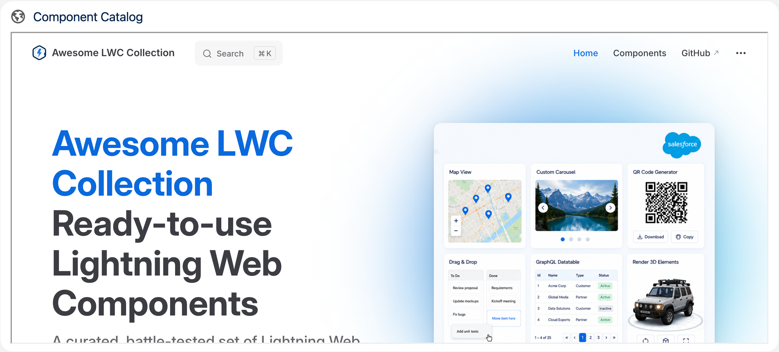
## Read on Medium
**[How to Build a Reusable iFrame with Lightning Web Components](https://medium.com/javascript-in-plain-english/how-to-build-a-reusable-iframe-with-lightning-web-components-76a2ad27286)**
## Attributes
| Name | Type | Default | Description |
| ---------- | ------- | --------------- | -------------------------------------------------------------------------------------------------------------------------------------------------------------------------------------------------------------------------------------------------------------- |
| card-icon | string | 'utility:world' | If show card option is active, the card icon is displayed in the header before the card title. It should contain the SLDS name of the icon. Specify the name in the format 'utility:down' where 'utility' is the category and 'down' the icon to be displayed. |
| card-title | string | '' | If show card option is active, the card title can include text and is displayed in the header above the iframe. |
| height | string | '500px' | Specifies the height of the iframe. Default height is 500 pixels. |
| sandbox | string | '' | Enables an extra set of restrictions for the content in an iframe. |
| show-card | boolean | false | If present, the iframe is wrapped in a lightning card to fit better into the overall page layout. |
| url | string | '' | Specifies the address of the document to embed in the iframe. |
| width | string | '100%' | Specifies the width of an iframe. Default width is 100 percent. |
## Usage
```html
```
Wrap it in a Lightning Card to match the cards around it on a page:
```html
```
Note that the target site must allow itself to be embedded in an iframe (X-Frame-Options / frame-ancestors). All attributes are also configurable in the Lightning App Builder, so no code is required to use the component.
## Custom Labels
The texts users see are Custom Labels, so they can be translated in Setup with the Translation Workbench. Copy them together with the component.
| Name | Value |
| ----------------- | ------ |
| IFrame_FrameTitle | iFrame |
---
---
url: /awesome-lwc-collection/components/openRecordPageFlowAction.md
description: Component to forward to a record page from flow.
---
# Open Record Page Flow Action
Component to forward to a record page from flow.
**Type:** Utility
**Available in:** Flow Screen
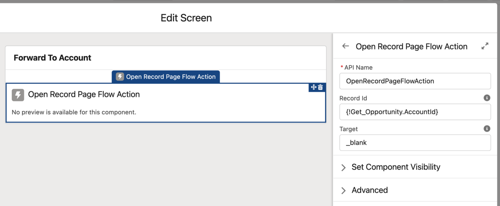
## Read on Medium
**[How to open a Record Page from Salesforce Flow using LWC](https://javascript.plainenglish.io/how-to-open-a-record-page-from-salesforce-flow-using-lwc-a8a94bc0c9ba)**
## Attributes
| Name | Type | Default | Description |
| --------- | ------ | --------- | ---------------------------------------------------------------- |
| record-id | string | | Record Id of the record page to which the action should forward. |
| target | string | '\_blank' | Open the page in the same '\_self' or in a new tab '\_blank '. |
## Usage
```html
```
Add the component to a screen element in the Flow Builder and set the record-id input attribute to the Id of the target record. As soon as the screen is displayed, the component navigates to the record page - in the same tab ('\_self') or a new tab ('\_blank') depending on the target attribute.
## Custom Labels
The texts users see are Custom Labels, so they can be translated in Setup with the Translation Workbench. Copy them together with the component.
| Name | Value |
| -------------------------------- | ------- |
| OpenRecordPageFlowAction_Loading | Loading |